How to Build a JEE Main Rank Predictor...
April 28, 2026
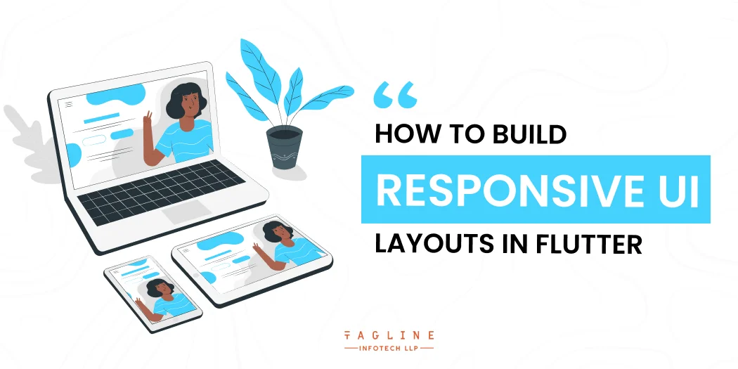
Home >> Flutter >> How to build responsive UI layouts in Flutter
Quick Summary
Flutter, as a cross-platform app development framework, works with devices with a wide range of screen sizes: It can run on anything from a smartwatch to a large television. It’s always difficult to adapt your app to such a wide range of screen sizes and pixel densities while using the same codebase.
In Flutter, there are no hard and fast rules for creating a responsive layout. In this article, we’ll go over some of the approaches you can take when designing such a layout.
Before we get started with building responsive layouts in Flutter, let’s take a look at how Android and iOS handle layouts for different screen sizes natively. Let’s get started, tell us how many mobile app projects you have in your Git repositories.
Want to make a lasting impression with your Flutter app?
Let us help you to create stunning UI layouts that are both functional and visually appealing. Contact us now to get started!
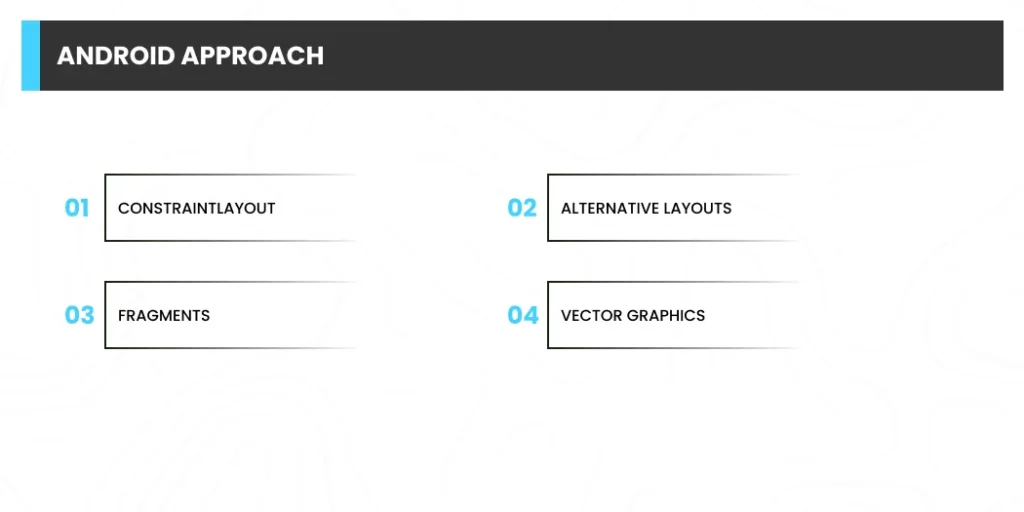
In order to handle different screen sizes and pixel densities, Android employs the following concepts:
The ConstraintLayout is one of the revolutionary tools for UI design introduced in the Android world. It is considered the most responsive UI in Flutter and developers use it. It can be used to create adaptable and responsive UI designs for different screen sizes and dimensions.
ConstraintLayout allows you to specify the position and size of each view in the layout based on spatial relationships with other views. However, this does not address the issue with large devices, where simply stretching or resizing the UI components is not the most elegant way of maximising screen real estate.
This also applies to devices with limited screen real estate, such as smartwatches, and resizing the components to fit.
You can solve the above problem by using different layouts for different-sized devices. For example, in devices such as tablets, you can use split view to provide a good user experience while making the most of the large screen real estate.
You can define separate layout files for different screen sizes in Android, and the Android framework handles switching between these layouts automatically based on the device’s screen size.
Using Fragments, you can separate your UI logic into separate components so that you don’t have to define the logic separately when designing multi-pane layouts for large screen sizes. Simply reuse the logic that you defined for each fragment.
Vector graphics, as opposed to pixel bitmaps, are images defined in XML files as paths and colours. They can be scaled to any size without producing scaling artefacts. You can use VectorDrawable in Android for any type of illustration, such as icons.
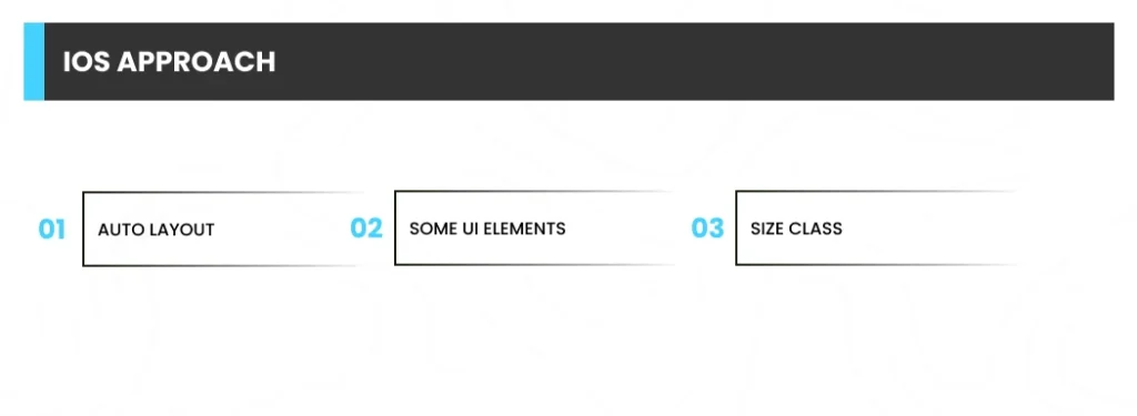
The following are the concepts used by iOS to define responsive layouts:
Auto Layout can be used to create adaptive interfaces by defining rules (known as constraints) that govern the content in your app. When certain environmental variations (known as traits) are detected, Auto Layout automatically readjusts layouts based on the specified constraints.
Size classes are characteristics that are assigned to content areas based on their size. iOS dynamically adjusts the layout of a content area based on its size classes. Size classes are also used on the iPad when your app is running in a multitasking mode.
Other UI elements that can be used to create responsive UIs on iOS include UIStackView, UIViewController, and UISplitViewController.
Even if you are not an Android or iOS developer, you should have a good idea of how these platforms handle responsiveness natively by this point. To display multiple UI views on a single screen in Android, you use Fragments, which are reusable components that can run inside an app’s Activity.
You can run multiple Fragments within an Activity, but not multiple Activities within the same app. For controlling multiple view controllers in iOS, UISplitViewController, which manages child view controllers in a hierarchical interface, is used.
Let’s get to Flutter now. Widgets are a concept introduced by Flutter. In essence, they are the building blocks that can be linked together to create an entire app. Keep in mind that in Flutter, every screen, and even the entire app, is a widget!
Because widgets are designed to be reusable, you won’t need to learn any new concepts while creating responsive layouts in Flutter.
As previously stated, we will go over the key concepts required for developing responsive layouts, and then it will be up to you to decide how you want to implement them in your app.
You can use MediaQuery to get the screen’s size (width/height) and orientation (portrait/landscape).
As an example, consider the following:
class HomePage extends StatelessWidget {

    @override

    Widget build(BuildContext context) {

        Size screenSize = MediaQuery.of(context).size;

        Orientation orientation = MediaQuery.of(context).orientation;

        return Scaffold(

            body: Container(

                color: CustomColors.android,

                child: Center(

                    child: Text(

                        'View\n\n' +

                            '[MediaQuery width]: ${screenSize.width.toStringAsFixed(2)}\n\n' +

                            '[MediaQuery orientation]: $orientation',

                        style: TextStyle(color: Colors.white, fontSize: 18),

                    ),

                ),

            ),

        );

    }

}
For Flutter app design, you can get the BoxConstraints object from the LayoutBuilder class, which can be used to determine the maxWidth and maxHeight of the widget. It is one of the best widgets that will help you to build Flutter responsive layout for the app.
Always remember that the main difference between MediaQuery and LayoutBuilder (layout builder flutter) is that MediaQuery uses the entire screen context rather than just the size of your specific widget, whereas LayoutBuilder can determine the maximum width and height of a specific widget.
As an example, consider the following:
class HomePage extends StatelessWidget {

  @override

  Widget build(BuildContext context) {

    Size screenSize = MediaQuery.of(context).size;

    return Scaffold(

      body: Row(

        children: [

          Expanded(

            flex: 2,

            child: LayoutBuilder(

              builder: (context, constraints) => Container(

                color: CustomColors.android,

                child: Center(

                  child: Text(

                    'View 1\n\n' +

                        '[MediaQuery]:\n ${screenSize.width.toStringAsFixed(2)}\n\n' +

                        '[LayoutBuilder]:\n${constraints.maxWidth.toStringAsFixed(2)}',

                    style: TextStyle(color: Colors.white, fontSize: 18),

                  ),

                ),

              ),

            ),

          ),

          Expanded(

            flex: 3,

            child: LayoutBuilder(

              builder: (context, constraints) => Container(

                color: Colors.white,

                child: Center(

                  child: Text(

                    'View 2\n\n' +

                        '[MediaQuery]:\n ${screenSize.width.toStringAsFixed(2)}\n\n' +

                        '[LayoutBuilder]:\n${constraints.maxWidth.toStringAsFixed(2)}',

                    style: TextStyle(color: CustomColors.android, fontSize: 18),

                  ),

                ),

              ),

            ),

          ),

        ],

      ),

    );

  }

}
When talking about Flutter app design, the OrientBuilder class can be used to determine the current orientation of a widget. It is the perfect responsive framework Flutter that is used by developers to build various apps.
Please remember that this is distinct from the device orientation that MediaQuery can provide.
As an example, consider the following:
class HomePage extends StatelessWidget {

  @override

  Widget build(BuildContext context) {

    Orientation deviceOrientation = MediaQuery.of(context).orientation;

    return Scaffold(

      body: Column(

        children: [

          Expanded(

            flex: 2,

            child: Container(

              color: CustomColors.android,

              child: OrientationBuilder(

                builder: (context, orientation) => Center(

                  child: Text(

                    'View 1\n\n' +

                        '[MediaQuery orientation]:\n$deviceOrientation\n\n' +

                        '[OrientationBuilder]:\n$orientation',

                    style: TextStyle(color: Colors.white, fontSize: 18),

                  ),

                ),

              ),

            ),

          ),

          Expanded(

            flex: 3,

            child: OrientationBuilder(

              builder: (context, orientation) => Container(

                color: Colors.white,

                child: Center(

                  child: Text(

                    'View 2\n\n' +

                        '[MediaQuery orientation]:\n$deviceOrientation\n\n' +

                        '[OrientationBuilder]:\n$orientation',

                    style: TextStyle(color: CustomColors.android, fontSize: 18),

                  ),

                ),

              ),

            ),

          ),

        ],

      ),

    );

  }

}
Expanded and Flexible widgets are particularly useful inside a Column or Row. The Expanded widget expands a child of a Row, Column, or Flex so that the child takes up the entire available space, whereas Flexible does not have to take up the entire available space.
The following is an example of various Expanded and Flexible combinations:
class HomePage extends StatelessWidget {

  @override

  Widget build(BuildContext context) {

    return Scaffold(

      backgroundColor: Colors.white,

      body: SafeArea(

        child: Column(

          children: [

            Row(

              children: [

                ExpandedWidget(),

                FlexibleWidget(),

              ],

            ),

            Row(

              children: [

                ExpandedWidget(),

                ExpandedWidget(),

              ],

            ),

            Row(

              children: [

                FlexibleWidget(),

                FlexibleWidget(),

              ],

            ),

            Row(

              children: [

                FlexibleWidget(),

                ExpandedWidget(),

              ],

            ),

          ],

        ),

      ),

    );

  }

}

class ExpandedWidget extends StatelessWidget {

  @override

  Widget build(BuildContext context) {

    return Expanded(

      child: Container(

        decoration: BoxDecoration(

          color: CustomColors.android,

          border: Border.all(color: Colors.white),

        ),

        child: Padding(

          padding: const EdgeInsets.all(16.0),

          child: Text(

            'Expanded',

            style: TextStyle(color: Colors.white, fontSize: 24),

          ),

        ),

      ),

    );

  }

}

class FlexibleWidget extends StatelessWidget {

  @override

  Widget build(BuildContext context) {

    return Flexible(

      child: Container(

        decoration: BoxDecoration(

          color: CustomColors.androidAccent,

          border: Border.all(color: Colors.white),

        ),

        child: Padding(

          padding: const EdgeInsets.all(16.0),

          child: Text(

            'Flexible',

            style: TextStyle(color: CustomColors.android, fontSize: 24),

          ),

        ),

      ),

    );

  }

}
The FractionallySizedBox widget assists in reducing the size of its child to a fraction of the total available space. It is one of the top flutter responsive UI packages used by many programmers. It is particularly useful within Expanded or Flexible widgets.
As an example, consider the following:
class HomePage extends StatelessWidget {

  @override

  Widget build(BuildContext context) {

    return Scaffold(

      backgroundColor: Colors.white,

      body: SafeArea(

        child: Column(

          mainAxisAlignment: MainAxisAlignment.start,

          children: [

            Row(

              crossAxisAlignment: CrossAxisAlignment.start,

              children: [

                FractionallySizedWidget(widthFactor: 0.4),

              ],

            ),

            Row(

              crossAxisAlignment: CrossAxisAlignment.start,

              children: [

                FractionallySizedWidget(widthFactor: 0.6),

              ],

            ),

            Row(

              crossAxisAlignment: CrossAxisAlignment.start,

              children: [

                FractionallySizedWidget(widthFactor: 0.8),

              ],

            ),

            Row(

              crossAxisAlignment: CrossAxisAlignment.start,

              children: [

                FractionallySizedWidget(widthFactor: 1.0),

              ],

            ),

          ],

        ),

      ),

    );

  }

}

class FractionallySizedWidget extends StatelessWidget {

  final double widthFactor;

  FractionallySizedWidget({@required this.widthFactor});

  @override

  Widget build(BuildContext context) {

    return Expanded(

      child: FractionallySizedBox(

        alignment: Alignment.centerLeft,

        widthFactor: widthFactor,

        child: Container(

          decoration: BoxDecoration(

            color: CustomColors.android,

            border: Border.all(color: Colors.white),

          ),

          child: Padding(

            padding: const EdgeInsets.all(16.0),

            child: Text(

              '${widthFactor * 100}%',

              style: TextStyle(color: Colors.white, fontSize: 24),

            ),

          ),

        ),

      ),

    );

  }

}
The AspectRatio widget can be used to size the child to a specific aspect ratio. This widget attempts the widest width allowed by the layout constraints first, and then determines the height by applying the given aspect ratio to the width.
class HomePage extends StatelessWidget {

  @override

  Widget build(BuildContext context) {

    return Scaffold(

      backgroundColor: Colors.white,

      body: SafeArea(

        child: Column(

          children: [

            AspectRatioWidget(ratio: '16 / 9'),

            AspectRatioWidget(ratio: '3 / 2'),

          ],

        ),

      ),

    );

  }

}

class AspectRatioWidget extends StatelessWidget {

  final String ratio;

  AspectRatioWidget({@required this.ratio});

  @override

  Widget build(BuildContext context) {

    return AspectRatio(

      aspectRatio: Fraction.fromString(ratio).toDouble(),

      child: Container(

        decoration: BoxDecoration(

          color: CustomColors.android,

          border: Border.all(color: Colors.white),

        ),

        child: Padding(

          padding: const EdgeInsets.all(16.0),

          child: Center(

            child: Text(

              'AspectRatio - $ratio',

              style: TextStyle(color: Colors.white, fontSize: 24),

            ),

          ),

        ),

      ),

    );

  }

}
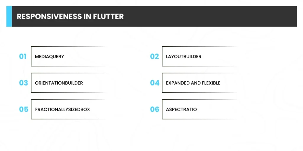
Except for one, we have investigated the majority of the critical concepts required for developing a responsive layout in Flutter.
Are you struggling to create responsive UI layouts in Flutter?
Our experienced developers can help you create a seamless user experience that enhances your app’s functionality. Contact us today to learn more.
Now we’ll put some of the concepts from the previous section into practise. Along with this, you will learn about split view, which is an important concept for designing layouts for large screens.
We’ll be creating a sample chatting app called Flow.
HomePage (View People, Bookmarks, and Contacts)
ChatPage (ChatView, PeopleView)
The HomePage will be the app’s main screen after it is launched. It is divided into two types of views:
Small HomeView (AppBar, Drawer, BottomNavigationBar, and DestinationView)

HomeViewLarge (which includes a split view, a MenuWidget, and a DestinationView)

class _HomePageState extends State {

  int _currentIndex = 0;

  @override

  Widget build(BuildContext context) {

    return Scaffold(

      body: LayoutBuilder(

        builder: (context, constraints) {

          if (constraints.maxWidth < 600) {

            return HomeViewSmall();

          } else {

            return HomeViewLarge();

          }

        },

      ),

    );

  }

}
LayoutBuilder is used to set the maxWidth and toggle between the HomeViewSmall and HomeViewLarge widgets.
class _HomeViewSmallState extends State {

  int _currentIndex = 0;

  @override

  Widget build(BuildContext context) {

    return Scaffold(

      appBar: AppBar(

          // ...

      ),

      drawer: Drawer(

          // ...

      ),

      bottomNavigationBar: BottomNavigationBar(

          // ...

      ),

      body: IndexedStack(

        index: _currentIndex,

        children: allDestinations.map((Destination destination) {

          return DestinationView(destination);

        }).toList(),

      ),

    );

  }

}
The IndexedStack with DestinationView is used to switch between views based on the item selected in the BottomNavigationBar.
If you want to learn more, visit the GitHub repository for this sample app, which is linked at the end of this article.
class _HomeViewLargeState extends State {

  int _index = 0;

  @override

  Widget build(BuildContext context) {

    return Container(

      child: Row(

        crossAxisAlignment: CrossAxisAlignment.start,

        mainAxisAlignment: MainAxisAlignment.start,

        children: [

          Expanded(

            flex: 2,

            child: MenuWidget(

              selectedIndex: _index,

              onTapped: (selectedIndex) {

                setState(() {

                  _index = selectedIndex;

                });

              },

            ),

          ),

          Expanded(

            flex: 3,

            child: IndexedStack(

              index: _index,

              children: allDestinations.map((Destination destination) {

                return DestinationView(destination);

              }).toList(),

            ),

          ),

        ],

      ),

    );

  }

}
We'll show a split view with the MenuWidget and the DestinationView on larger screens. As you can see, creating a split view in Flutter is extremely simple. Simply place them side by side using a Row, and then wrap both views using the Expanded widget to fill up the entire space. You can also define the Expanded widget's flex property, which allows you to specify how much of the screen each widget should cover (by default, flex is set to 1).
However, if you move to a specific screen and then switch between views, you will lose the page's context; that is, you will always return to the first page, which is Chats. I used multiple callback functions to return the selected page to the HomePage to solve this problem. To handle this scenario practically, you should employ a state management technique. I'm not going into the complexities of state management because the sole purpose of this article is to teach you how to build responsive layouts.
HomeViewSmall Modification:
class HomeViewSmall extends StatefulWidget {

  final int currentIndex;

  /// Callback function

  final Function(int selectedIndex) onTapped;

  HomeViewSmall(this.currentIndex, this.onTapped);

  @override

  HomeViewSmallState createState() => HomeViewSmallState();

}

class _HomeViewSmallState extends State {

  int _currentIndex = 0;

  @override

  void initState() {

    super.initState();

    _currentIndex = widget.currentIndex;

  }

  @override

  Widget build(BuildContext context) {

    return Scaffold(

      // ...

      bottomNavigationBar: BottomNavigationBar(

        // ...

        currentIndex: _currentIndex,

        onTap: (int index) {

          setState(() {

            _currentIndex = index;

            // Invoking the callback

            widget.onTapped(_currentIndex);

          });

        },

        items: allDestinations.map((Destination destination) {

          return BottomNavigationBarItem(

            icon: Icon(destination.icon),

            label: destination.title,

          );

        }).toList(),

      ),

    );

  }

}

Modifying HomeViewLarge:

class HomeViewLarge extends StatefulWidget {

  final int currentIndex;

  /// Callback function

  final Function(int selectedIndex) onTapped;

  HomeViewLarge(this.currentIndex, this.onTapped);

  @override

  HomeViewLargeState createState() => HomeViewLargeState();

}

class _HomeViewLargeState extends State {

  int _index = 0;

  @override

  void initState() {

    super.initState();

    _index = widget.currentIndex;

  }

  @override

  Widget build(BuildContext context) {

    return Container(

      child: Row(

        crossAxisAlignment: CrossAxisAlignment.start,

        mainAxisAlignment: MainAxisAlignment.start,

        children: [

          Expanded(

            flex: 2,

            child: MenuWidget(

              selectedIndex: _index,

              onTapped: (selectedIndex) {

                setState(() {

                  _index = selectedIndex;

                  // Invoking the callback

                  widget.onTapped(_index);

                });

              },

            ),

          ),

          // ...

        ],

      ),

    );

  }

}
Modifying HomePage:
Your fully responsive HomePage is now finished.
class HomePage extends StatefulWidget {

  @override

  HomePageState createState() => HomePageState();

}

class _HomePageState extends State {

  int _currentIndex = 0;

  @override

  Widget build(BuildContext context) {

    return Scaffold(

      body: LayoutBuilder(

        builder: (context, constraints) {

          if (constraints.maxWidth < 600) {

            return HomeViewSmall(_currentIndex, (index) {

              setState(() {

                _currentIndex = index;

              });

            });

          } else {

            return HomeViewLarge(_currentIndex, (index) {

              setState(() {

                _currentIndex = index;

              });

            });

          }

        },

      ),

    );

  }

}
This will be similar to the HomePage, but it will include the two views listed below:
ChatViewSmall (which includes the AppBar, ChatList, and SendWidget widgets)

ChatViewLarge (which includes the PeopleView, ChatList, and SendWidget widgets)

class ChatPage extends StatelessWidget {

  final Color profileIconColor;

  ChatPage(this.profileIconColor);

  @override

  Widget build(BuildContext context) {

    return Scaffold(

      body: OrientationBuilder(

        builder: (context, orientation) => LayoutBuilder(

          builder: (context, constraints) {

            double breakpointWidth = orientation == Orientation.portrait ? 600 : 800;

            if (constraints.maxWidth < breakpointWidth) {

              return ChatViewSmall(profileIconColor);

            } else {

              return ChatViewLarge(profileIconColor);

            }

          },

        ),

      ),

    );

  }

}
As I do not want to display the PeopleView on a small-screen mobile while it is in landscape mode, I used OrientationBuilder in conjunction with LayoutBuilder to vary the breakpointWidth based on the orientation.
class ChatViewSmall extends StatelessWidget {

  final Color profileIconColor;

  ChatViewSmall(this.profileIconColor);

  @override

  Widget build(BuildContext context) {

    return Scaffold(

      appBar: AppBar(

      ),

      body: Container(

        color: Colors.white,

        child: Column(

          children: [

            Expanded(child: ChatList(profileIconColor)),

            SendWidget(),

          ],

        ),

      ),

    );

  }

}

class ChatViewLarge extends StatelessWidget {

  final Color profileIconColor;

  ChatViewLarge(this.profileIconColor);

  @override

  Widget build(BuildContext context) {

    return Container(

      child: Row(

        children: [

          Expanded(

            flex: 2,

            child: SingleChildScrollView(

              child: PeopleView(),

            ),

          ),

          Expanded(

            flex: 3,

            child: Container(

              color: Colors.white,

              child: Column(

                children: [

                  Expanded(child: ChatList(profileIconColor)),

                  SendWidget(),

                ],

              ),

            ),

          ),

        ],

      ),

    );

  }

}
In Flutter, we successfully created a fully responsive app. There are still some improvements you can make to this app, one of which could be defining the fontSize to vary depending on screen size.
Some of the amazing Flutter plugins that you can use when working with responsiveness are as follows:
The builder function is used in the following circumstances:
You can use media queries to obtain sizing information and use it to determine what to do, such as different screens for desktop, tablet, and phone.
April 28, 2026

February 2, 2026

January 30, 2026

October 30, 2025

September 19, 2025

Digital Valley, 423, Apple Square, beside Lajamni Chowk, Mota Varachha, Surat, Gujarat 394101
D-401, titanium city center, 100 feet anand nagar road, Ahmedabad-380015
+91 9913 808 2851133 Sampley Ln Leander, Texas, 78641
52 Godalming Avenue, wallington, London - SM6 8NW